The magazines created this past semester are now online! Please check out lasaezine.magcloud.com to purchase student publications. (I've posted students' names and their respective magazines below).
On average, the print publications cost between $6 and $12, depending on the page count. The cost reflects the printing costs only, as we make no profit on any of these magazines. However, if you have any issues with the cost of ordering a magazine, please let me know and I would be happy to cover the cost for you. The students have worked so hard on the magazines this semester, so I want to make sure everyone who wants a copy gets one!
We've also published our magazines electronically on www.issuu.com/lasaezine. Embed codes are posted in case you'd like to include your magazine on your blog or Facebook profile, for example.
Thank you, students, for a wonderful semester. I am SO PROUD of your finished publications, and I look forward to seeing you in the halls next year! Enjoy your summer!!!
Student Magazines
1st period:
25K - Jeremy J., Caroline M., Mariah N., Chris P.
Driven - Jamie R., Matthew M., Kathy H.
Street Magic - Rania D., Brittanie J., Christy N.
Blizz - Abel C., Kebriana N., Miguel P., Kendall G.
Forum - Nathan W., Eduardo L., Alison M., Felix B.
Incite - Sofie B., Ariel S., Clarissa L.
5th period:
Vinyl - Anne Kat A., Mayrose P., Elizabeth C., Claudia C.
Now - Ishaan G., Daniel C., Yahir B.
Aux Cable - Arnav S., Natalie T., Lizza P., Anthony R.
7th period:
Current - Calvin S., Gus T., Douglas C.
Live Austin - Nathan R., Christian D., Gustavo M.
Dischord - Brandon R., Grace C., Kiaya S., Gaby G.
Piccante - Chaaru D., Shweta M., Vandana G., Estefani M.
Final Buzzer - Brian C., Bikramjit L.
Diffusion- X. Willis, Ben B., Daniel Z.
True Color - Deborah H., Faith J., Andy L., Akshara P.
Tuesday, May 31, 2011
Friday, May 27, 2011


Tuesday, May 17, 2011
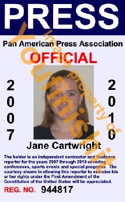
Press Passes
One of the awesome advantages of being a journalist is the access it grants. Journalists can often get behind-the-scenes glimpses into exclusive parties, concerts, and important political events -- all it (usually) takes is a press pass.
With your magazine launch parties quickly approaching, you'll want to make sure you and your group members have press passes to this invite-only event. Also, you'll want to make a press pass for your designer. You'll just need your logo, your head shot (and your designer's head shot) to make these passes.
With your magazine launch parties quickly approaching, you'll want to make sure you and your group members have press passes to this invite-only event. Also, you'll want to make a press pass for your designer. You'll just need your logo, your head shot (and your designer's head shot) to make these passes.
Here are some design pointers to get you started: If I were designing a press pass, I would create a new Illustrator document and I would create the same number of art boards as you need press passes. Here's how to work with artboards. I would make them around 3 x 4 (or 4.5). Then, once you have each group member's pass (and your designer's), try to fit as many as you can in an InDesign document so we can export and print on standard size paper. Be frugal with spacing so you can fit as many passes as you can on one 8.5 x 11 piece of printer paper. We can print these on the school color printer!
Check out these examples for some inspiration:

Sunday, May 15, 2011
It's pod-y time...
You've designed a magazine and kept your readers current through your blog. Now it's time to expand your content through another type of media: the podcast.
Here's the gist of the assignment:
--You must come up with an original idea. It can be video or audio.
--It must be at least 1 minute and 30 seconds.
--You must also write a paper.
--You must figure out how to edit and post it on your blog.
For editing, try Adobe Soundbooth or Audacity. (These are already installed.)
For posting on blog--Google it. :)
Here's the rubric. Your group podcast must be posted by the end of class on WEDNESDAY, MAY 25. Also, students MUST follow the permission given on signature sheet. So, if your parent said no photos, then, sorry, you can't be in the video.
Here are some examples from previous semesters.
Fictional Webisode
Review #1
Guided Shopping Trip
Review #2 ("Sights You Should See in Austin)
HAVE FUN!
Thursday, May 12, 2011
Exporting: Part 2
Check out this video to make sure your photos are linked and that you've checked your output separations.
Links, Output Separations (Part 2) from Kendra Young on Vimeo.
Friday, May 6, 2011
Tuesday, April 19, 2011
Check out this site...
Thanks to Brandon for passing along this site! Apparently, his interview source -- and one of our awesome design mentors -- Russell Toynes introduced it to him, and Brandon was kind enough to show it to me yesterday.
The creator (Jessica, below) obviously loves typography and has all kinds of cool type designs!

The creator (Jessica, below) obviously loves typography and has all kinds of cool type designs!
Wednesday, April 13, 2011
Good morning...
Hey all,
I'm out sick today but I wanted to make sure you got some important reminders and used class time today productively so that we can stay on track with the magazines.
Reminders:
Unit 2 Test Thursday -- Find a second review guide here (Remember, the first one was posted yesterday on the blog). If you have *any* questions, please email me today so that I can answer them before the test tomorrow.
Feature Stories -- Your rough draft will be due at the first part of class on Friday. You'll have all of class time today to work on the body portion (quotes and transitions) and part of the class tomorrow after the test to finish; if you don't finish then, you'll need to do it for homework. Remember to use this attribution handout that we reviewed in class to help you properly write quotes.
If you're having trouble thinking of how to link your ideas together, re-visit "Test of Faith" here, where you can see how the quotes and transitions keep the paper moving.
Feature Layouts -- We'll be working on those Friday, so be sure you have photos you can use.
Blogs -- No blogs due this week since I want you to focus on your feature stories. If you've already written one, you can apply it to next week when we'll start blogs back up again.
Extra credit -- Remember, if you'd like to do extra credit this six weeks, you can replicate a professional layout in InDesign and submit it. All layouts must be turned in Friday.
Hope to see you all tomorrow!
Tuesday, April 12, 2011
Unit 2 Test Review
Identify as informational, topical, or profile...
1. Barton Springs: A history of Barton Springs Pool and why people love it
2. Let's Get Physical: A summer guide to staying in shape as you wait for football season to start again
3. Riding the Wave: Google's newest social networking app that has people talking
Identify the nut graph and which specific sentences point to the story's relevance.
Ian Restil, a 15-year-old computer hacker who looks like an even more adolescent version of Bill Gates, is throwing a tantrum. "I want more money. I want a Miata. I want a trip to Disney World. I want X-Man comic [book] number one. I want a lifetime subscription to Playboy, and throw in Penthouse. Show me the money! Show me the money!"
Over and over again, the boy, who is wearing a frayed Cal Ripken Jr. t-shirt, is shouting his demands. Across the table, executives from a California software firm called Jukt Micronics are listening--and trying ever so delicately to oblige.
"Excuse me, sir," one of the suits says, tentatively, to the pimply teenager. "Excuse me. Pardon me for interrupting you, sir. We can arrange more money for you. Then, you can buy the [comic] book, and then, when you're of more, say, appropriate age, you can buy the car and pornographic magazines on your own."
It's pretty amazing that a 15-year-old could get a big-time software firm to grovel like that. What's more amazing, though, is how Ian got Jukt's attention--by breaking into its databases. In March, Restil--whose nom de plume is "Big Bad Bionic Boy"--used a computer at his high school library to hack into Jukt. Once he got past the company's online security system, he posted every employee's salary on the company's website alongside more than a dozen pictures of naked women, each with the caption: "the big bad boy has been here baby." After weeks of trying futilely to figure out how Ian cracked the security program, Jukt's engineers gave up. That's when the company came to Ian's Bethesda, Maryland, home--to hire him.
And Ian, clever boy that he is, had been expecting them. "The principal told us to hire a defense lawyer fast, because Ian was in deep trouble," says his mother, Jamie Restil. "Ian laughed and told us to get an agent. Our boy was definitely right." Ian says he knew that Jukt would determine it was cheaper to hire him—and pay him to fix their database--than it would be to have engineers do it. And he knew this because the same thing had happened to more than a dozen online friends.
The unit test will also cover the following:
Layout analysis (how a designer uses elements to guide a reader's eye, how it relates to story content or evokes a mood or feeling)
Nut Graph - Be able to define, identify
Type of Lead - Be able to identify narrative, descriptive, startling statement, twist, direct quote, compare/contrast
Interview quotes - Be able to tell which should be direct quotes, and which should be paraphrased/used as background transition
Identify a quote that uses proper/improper attribution.
Explain the purposes of transitions.
Identify poor forms in feature writing (first person, "when asked," cliches, "imagine this"-type leads)
Stephen Glass (know the basics of the movie and why this was such a breakthrough in online journalism)
Monday, April 4, 2011
Awesome Analysts
I was really impressed when I checked out some of your responses to the layout analysis quiz -- especially since you had just 4 minutes to analyze each!
All of you contributed some interesting insight when analyzing the layouts, but the below responses received maximum credit:


Response: Color is being used to bring attention to important elements of the article. The section header, headline, and pull quote are all given the same turquoise line to give the words contrast from both the white background and the primarily tan color of the photographs.
Response: Lines are being used to create a sense of organization in the layout. The thick, black lines separate the title and subheadline, as well as outline the blurb at the beginning of the story. This makes it so that the text isn't all jumbled together and gives the layout a clean look.


Response: This layout uses value and size. The right page is full of deliciousness and is very 3-D looking, and looks as if it's about to pop off the page. The "50" has a shadow behind it, making it also appear 3-D. Therefore, the value and size incorporated within this layout emphasizes the important parts that the designer intended to emphasize.
All of you contributed some interesting insight when analyzing the layouts, but the below responses received maximum credit:


Response: Color is being used to bring attention to important elements of the article. The section header, headline, and pull quote are all given the same turquoise line to give the words contrast from both the white background and the primarily tan color of the photographs.
Response: Lines are being used to create a sense of organization in the layout. The thick, black lines separate the title and subheadline, as well as outline the blurb at the beginning of the story. This makes it so that the text isn't all jumbled together and gives the layout a clean look.
Response: This layout uses lines to separate the photos and underlines certain places to separate them from others (for example, the title from the text or the title from the photo). There is also a line at the end of the layout to bring closure.
Response: In my opinion, the most prominent element in this design is size. The pictures differ in size, putting more emphasis on the larger one. The "In Cinemas" is much larger than "Prince of Persia," leading the eye to read that first. Since the article is about a movie, it is appropriate to take up more space with a large screenshot than actual text to keep the reader interested (another way in which size is used within this layout). The font size in the caption also creates a distinction between the body copy and the caption itself.
Response: In this design, lines are being used to separate the headline and subheadline from the text. The lines sort of box in the text and direct the eyes well, keeping us focused on what the designer wants us to look at first.


Response: The shape in this layout is a recurring theme. The fat letters and the thick squiggles bring an almost nostalgic mood to the article, and the retro vibe definitely enforces the topic [of the history of clubs that made Austin what it is today].

Response: The shape in this layout is a recurring theme. The fat letters and the thick squiggles bring an almost nostalgic mood to the article, and the retro vibe definitely enforces the topic [of the history of clubs that made Austin what it is today].
Response: An element which is very evident in this layout is color. The art is very colorful, along with the decorative designs, the drop cap, and the lines. Since Austin is a very artistic city, it is appropriate to have unique art along with the article. The color draws the eye from the left page where the title is featured to the top of the right page, then down to the bottom right of the right page. The colors used keep the article looking interesting and fun to read, enticing readers to actually read it instead of gloss over it.
Response: This design has a great use of color in it. On the first page, the main colors are yellow, orange, and pink. These colors are then pulled from the art. The orange is used for the drop cap, the pink for the caption, and the yellow for the lines at the bottom. The swirls at the top also use this color theme. This keeps a constant theme running through the article that keeps the main art connected with the rest of the design.


Response: This design uses color by making the word "Fray" a red color. This separates the word from the rest of the headline and makes the article seem more scary and deadly, since red reminds us of blood. The title of the caption is also in dark red, keeping the theme running throughout the article.


Response: This layout uses value and size. The right page is full of deliciousness and is very 3-D looking, and looks as if it's about to pop off the page. The "50" has a shadow behind it, making it also appear 3-D. Therefore, the value and size incorporated within this layout emphasizes the important parts that the designer intended to emphasize.
Attribution
Check here for the first three questions/answers.
Paraphrasing:
Original: According to a new study from Edinburgh Napier University, the more friends people have on Facebook, the more likely they were to be stressed out. The researchers who conducted the analysis noted that "for a significant number of users, the negative effects of Facebook outweigh the benefits of staying in touch with friends and family."
Approximately 200 students were used in this particular study. Dr. Kathy Charles, the woman who led this particular research, brought up the following points in relation to her study in a prepared statement: "For instance, although there is great pressure to be on Facebook, there is also considerable ambivalence among users about its benefits."
Response: A recent study by Edinburgh Napier University has shown that people with more Facebook friends were more likely to be stressed out. The study noted that "for a significant number of users, the negative effects of Facebook outweigh the social benefits." Dr. Kathy Charles, leader of the study, noted that "there is considerable ambivalence among users about [Facebook's] benefits."
Response: In a study led by Dr. Kathy Charles at Edinburgh Napier University, researchers have found that the more friends someone has on Facebook, the more likely it was that they were stressed out. The researchers noted that "for a significant number of users, the negative effects of Facebook outweigh the benefits of staying in touch with friends and family."
Response: A recent study from Edinburgh Napier University suggests that people who have more friends on Facebook are more likely to be stressed out as well. These reports show that "the negative effects of Facebook outweigh the benefits," although lead researcher Kathy Charles says that "there is also considerable ambivalence among users about its benefits."
Friday, April 1, 2011
April 1, 2011
Good morning/afternoon, Ezine! Today, you'll be working on magazine designs, but a couple of quick reminders first:
*If you need to turn in a recorder or camera, please see Ms. Richey. If you need to check out a recorder, see Ms. Richey at the end of the school day.
*Blogs are due today! Next week's blog assignment is to explain your interviewing experience -- how you decided on a source, how you came up with your questions, what the actual interview was like.
*True Colors: Sad news. Kara can't make it today, but she would love for you to send her what you have so far (as a pdf) if you haven't already. She's planning to visit soon, though, and wants to give you feedback in the meantime via email.
*Due Dates: 1.2 and 5.6 classes, your interview notes (either recorded or on paper) are due Monday in class. You'll have all period to transcribe your notes on Monday. If you're bringing a sound file to transcribe, be SURE to bring your earbuds. This is for a completion grade, so late credit will apply if you don't have your notes and/or your sound file and earbuds.
Today's assignments:
1. Read Please read this article; it should be a good reminder of what sort of details it's important to notice when collecting research and conducting interviews for your feature. After reading it, please send me a group email that explains what sort of details you could each incorporate into your own features. (If you've already conducted your interview, tell me what you noticed that you could include; if you haven't conducted your interview, tell me what types of details you will now look for.) We'll discuss Monday.
2. Feature Designs Begin mapping out your feature design. I highly recommend finding a professional layout to guide you since it will adhere to column guides, etc. Plus, you can use this layout to help you determine what kind of art (full-page photo, half-spread photo with a sketch applied, etc.) to your own layout. Then, when you conduct your interview, you'll know what kind of photos you need to take. If you've already taken your pictures, you'll be able to find layouts that use similar images. This magazine, for example, used some design inspiration from Wired and their layouts look really professional.
3. Table of Contents (2 people could work on this)
You should have an idea how many pieces your magazine will have: opinion, feature, major ASF, bios, letter from the editors. You do NOT have to know what specific page everything goes on yet, but you should be able to map out a general plan using your style sheet, bleeds, etc.
Examples
4. Bios Check out these student magazines for some cool ideas on how to map out yours.
Nom
Wallflower
Montage
Input
Bubblegum (This one had a creative idea for bio pics -- both on the cover and the actual bio page)
A little April Fool's joke on the web: Google "Helvetica." Pretty funny, Google... :)
Monday, March 28, 2011
Tuesday, March 22, 2011
Tuesday, March 8, 2011
Interesting Time Magazine cover this week
I saw this Time Magazine cover in the supermarket check-out line, and it made me look twice. Pretty clever, if you ask me...


Stolen from Ezine Empire...
I saw this on Ms. Richey's blog and thought this campaign was really interesting -- and sad. The juxtaposition of the stark, elegant background with these kids in their paper clothing is striking.
New Ark Mission of India posters: "

After long hot summers, the winter months take a violent toll on India’s poor who are often ill-prepared for the extreme cold. In addition, street children and beggars are a rarely-acknowledged blind spot. In response, Ogilvy & Mather, Bangalore dressed street children in their everyday clothes (made from discarded newspapers, sacking, cardboard) and photographed them walking a fashion catwalk. The juxtaposition of the usual in an unusual setting created awareness among the population. The campaign was executed as a series of posters and standees in corporate offices and churches with the goal of receiving 3,500 sets of clothes for New Ark Mission; the non-profit received over 6,000 sets of clothes and significant monetary contributions.
copy: To 33.4% of the population in Karnataka, garbage is fashion. Please donate your old clothes. New Ark Mission of India. 98452 81915. www.newarkmission.org
Credits: www.ogilvy.com
| www.newarkmission.org


"
New Ark Mission of India posters: "
After long hot summers, the winter months take a violent toll on India’s poor who are often ill-prepared for the extreme cold. In addition, street children and beggars are a rarely-acknowledged blind spot. In response, Ogilvy & Mather, Bangalore dressed street children in their everyday clothes (made from discarded newspapers, sacking, cardboard) and photographed them walking a fashion catwalk. The juxtaposition of the usual in an unusual setting created awareness among the population. The campaign was executed as a series of posters and standees in corporate offices and churches with the goal of receiving 3,500 sets of clothes for New Ark Mission; the non-profit received over 6,000 sets of clothes and significant monetary contributions.
copy: To 33.4% of the population in Karnataka, garbage is fashion. Please donate your old clothes. New Ark Mission of India. 98452 81915. www.newarkmission.org
Credits: www.ogilvy.com
| www.newarkmission.org
"
Thursday, March 3, 2011
Headline Voting!
Here's a list of headlines from Mrs. Young's classes.
Here's a list of headlines from Ms. Richey's classes.
Submit your vote by writing your favorite 3 headlines (in order of favorite) on a paper ballot and turning it in to Mrs. Young.
Winners will be announced on Friday!
Here's a list of headlines from Ms. Richey's classes.
Submit your vote by writing your favorite 3 headlines (in order of favorite) on a paper ballot and turning it in to Mrs. Young.
Winners will be announced on Friday!
Wednesday, March 2, 2011
Tuesday, February 22, 2011
A note from your fellow group...
DEAREST READERS,
We, the VINYL staff, invite you with open arms to ask questions for our new ADVICE COLUMN.
Any and all* questions will be accepted and answered to the best of our ability.
...With some introduction at the front, if you'd like.
Please send these cries for help to vinylstaff@gmail.com.
MUCH THANKS,
Vinyl Staff
*And by all we mean most."
Thursday, February 17, 2011
Tuesday, February 15, 2011
And the winners are...
Congratulations to 25K, Aux Cable, and Current Magazines! You three groups are the Media Kit contest winners. See me in class (or email me) about your prize.
I saw some truly excellent media kits, so all of you should be very proud of yourselves. We'll have future design contests, so stay tuned!
~ Mrs. Young
Thursday, February 10, 2011
Mrs. Young Out - Day 2
Happy late start day to you, happy late start day to you, happy laaaate start day to you.... Happy late start day to you.
Hope you all enjoyed sleeping in. I'm bright-eyed (after much coffee) and back at my technology workshop today, but I wanted to give you a couple of heads-up for tomorrow:
1) Media Kits are due (emailed) to me by the end of class Friday. You'll be presenting your kit on Monday to the class.
2) Designers are visiting after the quiz.
1st period: Adrian will be meeting with Forum and Blizz. I'm still waiting to hear back from Melissa (Street Magic's designer); I'll email your group if I hear from her today. If she doesn't respond, I'll see if we can get some designers from The Liberator to come critique your media kits before you present Monday.
5th period: Josh will be meeting with Now Magazine, and Victor will be meeting with Vinyl
Magazine.
7th: Kara will be meeting with True Colors Magazine, and Sarita will be meeting with the Daily Muncher. Ron will be meeting with Dischord on Monday, Feb. 14. I'm still waiting to hear back from Greg, Chia-Wen, Stephanie, and Kirk. If they don't respond, I'll see if we can get some designers from The Liberator to come critique your media kits before you present Monday.
3) You're having a quiz on the terms we've covered in the last couple of weeks. The newsworthiness examples were posted in Tuesday's quiz review (on the calendar and yesterday's blog post), and you can refresh your memory regarding leads with this handout. Both the leads and the newsworthiness questions will be multiple choice.
The design identification portion of the quiz will not be multiple choice, nor will it have a word bank... because life does not have a word bank. Actually, it's because you'll need to know these terms when talking design in your group.
Here's a link to a design review. You'll need to download the pdf and then click on the comments to see what each part of the design is called. (Depending on what version of Adobe Acrobat you have, you may not be able to access this at home, so take notes in class if needed.)
A few parts are not identified. For example, you'll need to know what a document grid does (allows the designer to create logical spatial relationships between objects and text) and how column guides work to dictate how many columns of text should exist and how large an image should be.
4) I'm still looking over your outlines and leads and should have commented on all of them tomorrow so you can proceed with concessions and supporting paragraphs, both of which we'll cover in class.
5) Have a wonderful day! I'm learning a lot of interesting things about Photoshop and podcasting, and I look forward to showing you guys some new stuff!
~ Mrs. Young
Wednesday, February 9, 2011
Mrs. Young Out - Day 1
Good morning/afternoon, Eziners. I'm out at a technology conference today, but you have plenty to do in good ol' room 258 without me. You'll need to email me your finished media kits (both the pdf and the written paper) by the end of class Friday. Here's a link to the assignment if you want to double-check to make sure you've covered everything. Remember, it's a major grade (one of only two for this grading period), so you'll want to make sure it's polished and professional.
Don't forget that you also have a quiz Friday over newsworthiness, design, and lead terms. Refer to yesterday's quiz review for a refresher.
Ok, I think that's it for today. Please email me if you have any questions, and I'll check in with you tomorrow via the blog regarding your outlines and leads.
~ Mrs. Young
Thursday, February 3, 2011
Wednesday, February 2, 2011
Why We Need to Reimagine Masculinity
Read this article from Newsweek -- which is PACKED with sources. Then, in your turn-in folder, turn in a document (labeled with your name and the assignment) that lists all of the sources that the author used.
Monday, January 31, 2011
Impressive Ads


Friday, January 28, 2011
Opinion Ideas
When it comes to opinions, we all have one. Just think of sites like Yelp and CitySearch where people post their (unpaid and unsolicited) reviews. If you look at a week's worth of your Facebook statuses, you'd probably see somewhere that you posted an opinion (probably something like "Ezine is the best class ever!" Right? Right??)
But when it comes to writing a 600-word piece, it can seem difficult to find a good idea.
Here's what you need to think about when you're coming up with your idea:
1. Is it newsworthy in some way?
Example: A student yesterday wanted to do a piece on gay marriage but felt it was overdone. But, once he searched Google News for "gay marriage," he found that there had been many developments with regard to how states were addressing the issue. Then, he felt he could write a piece about how Texas was still really far behind the curve. His idea now has the elements of proximity (most of his readers are here in the Lonestar State) and impact -- since most people will, at some point, get married and are therefore inherently interested in the topic.
2. Is it focused?
It's easy to want to take on the world (e.g., "We should all shop local!") but it's hard to come up with specific reasons that back up your point. Here is a good example from last semester of a focused argument.
The Vibe: Why we should use libraries for books rather than bookstores.
3. Can you find plenty of research to back up your opinion?
Sorry, you're not the only expert source you can use. Sure, you can cite personal experience, but you'll need outside sources -- and credible ones at that -- to support your stance.
Some other good examples:
Sports (The goal line piece)
A pro-con piece
Friday, January 21, 2011

Tuesday, January 18, 2011
Thursday, January 13, 2011
Color can be so moody...
How does your perception of this layout change when the colors are adjusted?


Tuesday, January 11, 2011
Font Fun
Favorite Font Videos
Here are a couple of fun font videos. Enjoy and remember: Typography matters!
http://vimeo.com/m/#/18499580
http://www.collegehumor.com/video:1823766
Here are a couple of fun font videos. Enjoy and remember: Typography matters!
http://vimeo.com/m/#/18499580
http://www.collegehumor.com/video:1823766
Sunday, January 9, 2011


When brainstorming what kind of magazine you want to do, we have to get a couple of things in order first: Who is your target audience, what is your mission, and what kind of content can readers expect to see?
Current magazine have all of that together so they can target potential advertisers for their publication. Conde Nast is one of the largest media marketing companies in the world. Take some time to look at the media kits of some of the most famous magazines in existence.
Thursday, January 6, 2011
Magazine Applications
Fill out the magazine application here. I'll look over all of these and will put you into groups first thing Monday morning.
Tuesday, January 4, 2011
Assignment #1: The Magazine Cover

In an effort to help you understand your classmates' interests and personalities, you'll each be creating a magazine cover. You'll also turn in an explanation of the elements you used and will give a brief description of it during class Thursday. Here's the assignment.
Need some inspiration? No problem.
Above, you can see the cover I made. Here's a link to my description of it.
Once you're ready to turn everything in, you can give me your cover and then email your description to me (as a Google doc or a Word doc -- it's up to you) at lasaezine@gmail.com. The subject should read: Name_Assignment_Class Period. So if I were in 1st/2nd block, my subject would read "Kendra Young_Magazine Cover_1.2."
Thanks, and I look forward to hearing about your magazines tomorrow in class!
Welcome!
In this class, you'll learn Adobe CS5 programs, how to write journalistic pieces, and how to make a professional quality magazine. Get excited: It's going to be awesome.
Subscribe to:
Posts (Atom)